
TL;DR

Get decor and gifts delivered free with Prime
- Fast, free delivery on millions of items
- Prime Video, Amazon Music and more included
- Member-only deals all year
House Beautiful published a report featuring six paint colors that interior designers say can lend rooms a vintage or heritage-inspired feel. The palette ranges from butter yellow and warm parchment to oxblood and midnight blue; the effect depends on the room, lighting and surrounding finishes.
House Beautiful has published a report naming six paint colors that interior designers say can give rooms a more vintage, lived-in character, including Wedgwood blue, butter yellow, oxblood, warm parchment, pale peach and midnight blue. The recommendations describe design choices and professional impressions, not a tested formula or guarantee that a particular shade will make a home look older.
The colors span muted neutrals, warm pastels and saturated darks. Wedgwood blue, a dusty blue-gray, was recommended by Jessica Risko Smith of Santa Barbara firm JRS ID. She said the shade changes with the light and can evoke old European farmhouses or coastal cottages. Her team used it in a kitchen renovation to give new cabinetry a sense of age and permanence.
New York City designer Andrew Suvalsky described butter yellow as playful and connected to the 1960s, while Graham & Brown design expert Iona Graham said oxblood can bring warmth and a heritage-inspired mood, particularly in smaller rooms or on accent walls. Graham also suggested it for color drenching, where a room is covered in one color or closely related tones.
The remaining recommendations are warm parchment, a softened white with yellow or blush undertones; pale peach, which Suvalsky said can feel both fresh and cozy; and midnight blue, a deep shade he described as regal and architectural. The report points to examples pairing dark blue with gilded details, warm wood and brass, underscoring that paint is only one part of a room’s overall look.
How Color Can Suggest a Home’s Age
The designers’ advice offers homeowners a relatively direct way to change a room’s mood without replacing furniture or adding decorative objects. A carefully chosen wall or ceiling color can make a new space feel softer or more established, while a saturated shade can add visual depth. That may be useful to people in new-build or builder-grade homes who want more character, as well as residents seeking to emphasize older architectural features.
These effects are design judgments rather than measured outcomes. The article does not compare paint colors in controlled settings or claim that any shade will work equally well in every home. Light, room size, existing materials and furnishings all affect how a color reads, as the designers’ examples themselves suggest.
Popular right now

Shark Rocket Corded Stick Vacuum (HV301) – Gray/Orange

Dyson Airwrap i.d. Multi-Styler for Straight and Wavy Hair

De'Longhi Magnifica Evo Fully Automatic Espresso Machine with Manual Milk Frother, Silver
As an affiliate, we earn on qualifying purchases.
Six Shades, Different Design Histories
The report frames vintage style as a feeling of heritage and familiarity, not as a strict historical restoration. Its palette draws on different associations: butter yellow is linked by Suvalsky to the 1960s, while pale peach is described as appearing in both muted midcentury interiors and brighter 1980s schemes. Wedgwood blue is presented through associations with older European farmhouses and coastal cottages.
The range also shows that “vintage” does not mean only pale or faded colors. Oxblood and midnight blue offer a more dramatic interpretation, while parchment provides a quieter alternative to stark white. House Beautiful’s report relies on comments from the named designers and examples of their projects; it does not establish a single definition of vintage color or provide a ranking of the six choices.
““It reads differently in every light: almost slate in the morning, almost soft denim by afternoon.””
— Jessica Risko Smith, interior designer at JRS ID, as quoted by House Beautiful
What the Color Advice Cannot Promise
The report does not specify paint brands, product names, exact color codes or finish types for the six shades, so readers cannot reproduce the examples from the descriptions alone. It also gives no testing method or evidence that these colors consistently make homes look vintage. Results will vary by lighting and setting, and the designers’ comments should be read as expert opinions rather than universal rules.
It is also unclear from the source whether the six shades are intended as a complete palette for one home or as separate options for different rooms and styles. No publication date is included in the supplied report material.
Choosing a Shade for Your Room
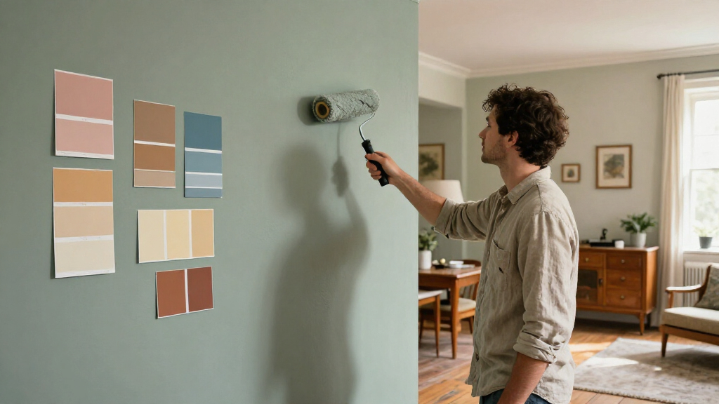
The report does not announce a product launch, scheduled event or formal follow-up. For homeowners using the recommendations, the practical next step is to compare paint samples in the room at different times of day and alongside existing floors, cabinetry, fabrics and metal finishes. A dusty blue-gray may shift noticeably with daylight, while deep oxblood or midnight blue can have a stronger effect in a small or dim room.
House Beautiful’s recommendations can serve as a starting point, but the article leaves the final choice to the homeowner and the specifics of the space. Testing samples before painting can help show whether the intended warm, muted or dramatic effect holds under the room’s actual conditions.
Key Questions
Which six colors did the designers recommend?
The six are Wedgwood blue, butter yellow, oxblood, warm parchment, pale peach and midnight blue.
Are these colors proven to make a home look vintage?
No. House Beautiful’s report presents designers’ opinions and project examples; it does not describe controlled testing or promise a particular result.
Which color was suggested for smaller rooms?
Iona Graham said oxblood can work particularly well in smaller rooms or on accent walls, where it may create a cocooning atmosphere.
What should homeowners check before choosing a shade?
Compare samples in the room at different times of day and against existing wood, cabinetry, flooring and furnishings. The source notes that light can change how a color appears.
Source: housebeautiful.com